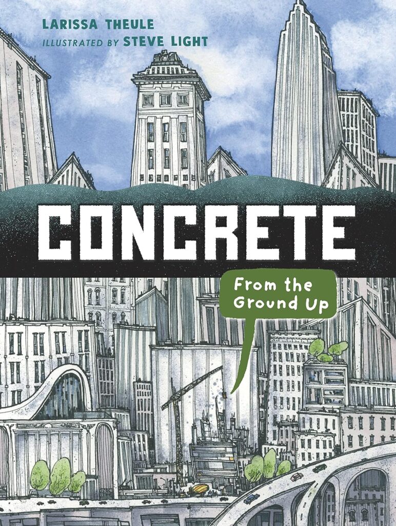
There is a point in time when that illustrated book that you read to elementary-aged students has content that you didn’t know. It won’t happen with every illustrated book, but the non-fiction ones especially might bring up facts that you adults didn’t know or realize. In Concrete: From the Ground Up, that point came for me when the book said “Cement is not the same as concrete.” That was on the third page and when I looked back at the first two pages there were also facts that I didn’t know. Concrete is not trying to be a primer on construction for children, it’s that it’s an intelligent book, that’s punctuated with lots of humor and illustrations.
If a non-fiction illustrated book is not entertaining, then its sole purpose is to speak to the choir. Much to the chagrin of Mike Rowe and engineers across the land, working with concrete is not a major that I see being explored in the school system. This is the struggle of non-fiction illustrated books on any subject. How do you make one area approachable to all young readers, while respecting the fun things that they don’t know about the topic that makes it curious to them in the first place?
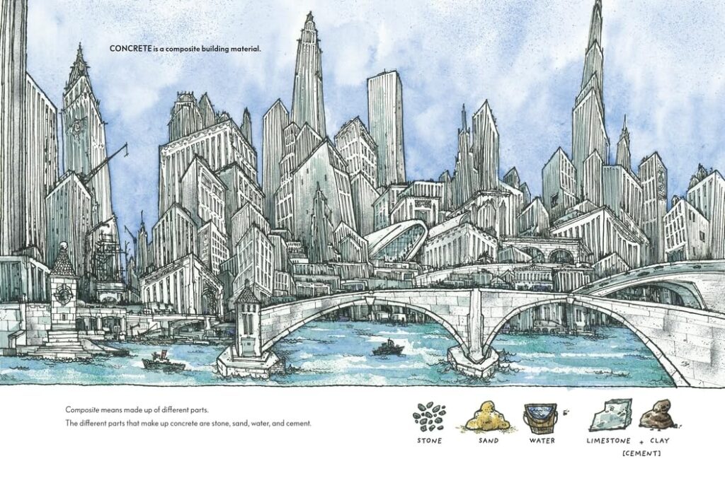
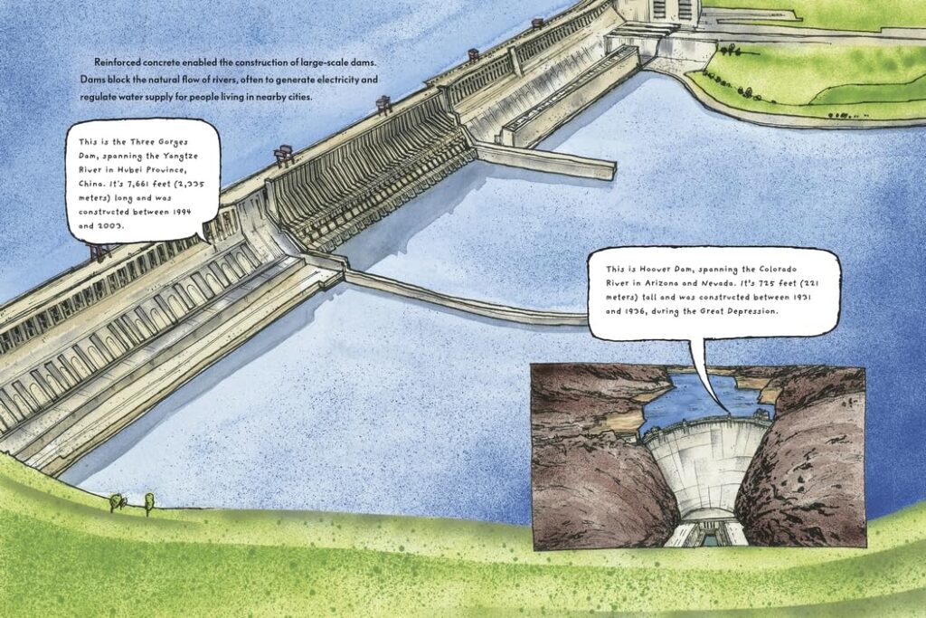
Concrete: From the Ground Up, pardon the pun, builds bridges to those young ages by allowing lots of space for the illustrations to wander. The illustration of the Three Gorges Dam spans two pages and has a panel of the Hoover Dam on it also. However, there isn’t much text on those two pages and the effect allows young emerging readers to absorb what they’ve just read or heard, and then think about the challenging task that was overcome before them.
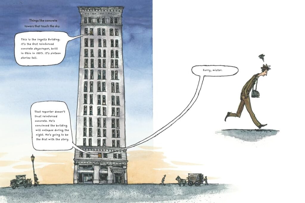
That same result is played for the opposite effect when we see the Ingalls Building, which was the first reinforced concrete skyscraper that was built in 1903. On that two-page spread we only see a close-up of a reporter, who didn’t trust concrete, leaving that building in dismay after their story about the building falling down overnight didn’t come to pass. That reporter’s exit is played for laughs as the ‘narrator’ on the page wishes them good luck. The building’s illustration really shows the height of it by having the uppermost part in a darker blue sky, while its base is illuminated by a peach background.
Readers will learn that that the Berlin Wall was actually two walls, with a space between them. They’ll also discover that this area and the rabbit inhabitants, who continue to live in the ‘dead zone’, kept on doing their thing. Some of the pages in Concrete have color from corner-to-corner and other pages use negative space to provide the action. The varied nature in the way that the book presents the content effortlessly pushes the story forward, from highlighting an avant guard art exhibit in the Utah desert to asking an open-ended question about what young readers think the future of concrete could hold.
It’s these silly questions that could help motivate elementary audiences to think about things that adults can’t see. Our sixth grader came into the kitchen today and had some wacky idea about expediting store checkout lines. While I’m all for making the process faster, there was one key aspect of his proposal that went sideways. We pointed out this issue and said that the rest of it was solid and to see how it could work now. Will some youth reading Concrete: From the Ground Up think of a new use, mixture or possibility for this thing that most people engage with daily, but don’t give a second thought about? It’s a fun non-fiction, illustrated book that answers a “why” that many kids have never asked, certainly don’t know the correct answer to and will open up their critical thinking skills just a little bit.
Concrete: From the Ground Up is Larissa Theule with illustrations by Steve Light and is available on Candlewick Press.
There are affiliate links in this post.


 Facebook
 Twitter
 Flickr
 GooglePlus
 Youtube