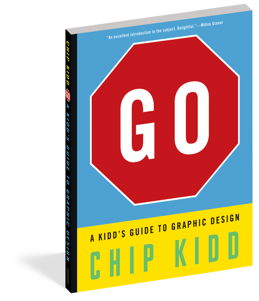
The other day I was put into art class as the substitute teacher. The assignment was rather simple and as I was providing them their different options I was using terms like disparate, negative space, abstract, hyper-realism, scale or symmetry. Then, to illustrate what the students looked like, I brought in a deer and turned on my car’s headlights that illuminated its bulbous eyes. Go: A Kidd’s Guide to Graphic Design was originally published as a hardback book and is now available in soft cover. Students, don’t get freaked out because a book has now been released in a format that’s more palatable for you. This is an illustrated, reference book that’s effortless to look at and presents its information in page nuggets that educate through entertainment.

Students, also don’t get freaked out because you’re looking at a book that’s meant to be educational, yet you’re enjoying the process. Just take a deep breath, look at the different examples of how graphic design can impact what it’s representing, and be happy. These are examples of effective advertising, usability, information, or functionality, in action, but you might not have realized why you were paying attention to whatever it is.
It’s also a book that art classes, and especially those graphic design classes need to have in their library.

In the class I was teaching one of the choices was to write something in graffiti style. I explained to them that the text could be any size, relative to what it’s printed on, and in different ways to drive home its message. A couple of the students took that message to heart and created something that grabbed your attention. The others directly copied the example that was on the sheet that I handed out.
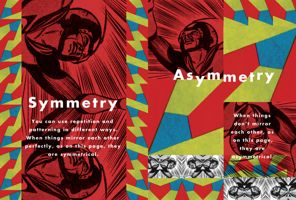
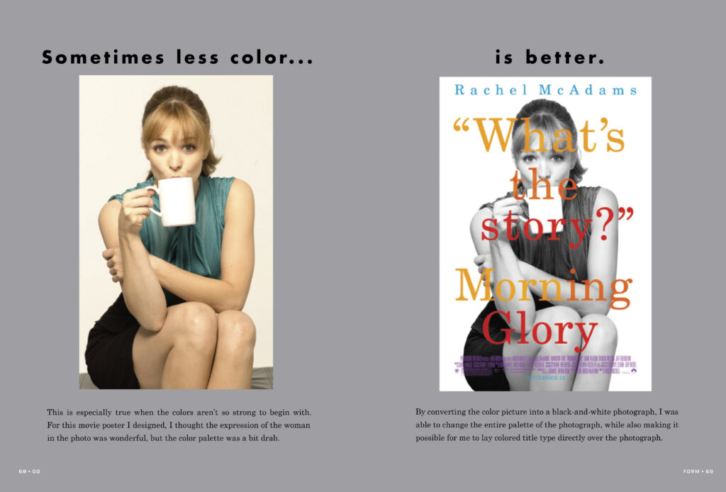
Author Chip Kidd collects examples that show how each distinct style, even amongst subtle differences, can alter their impact. An image with a higher DPI is needed for print, yet one that’s very low is so blocky and rigid, resembling a Minecraft character almost, that it’s interesting. Yellow is not always yellow. When you’re printing or painting the Pantone system of determining precisely what shade of color you want is mandatory. Certain shades of yellow will express one thing, whereas others will broadcast something entirely different. Symmetry and using shapes in asymmetrical patterns are also a lot of fun, but getting kids to think that far outside of the box might be challenging.

Go: A Kidd’s Guide to Graphic Design is an entry point into the world of graphic design. It’s also entertaining and will provide dozens upon dozens of ideas for students’ projects to make them more engaging and will yield higher praise. Higher praise could bring about better grades and when you’re in school, that’s the name of the game. A “B” on a project is good, but what if the same content were presented with just a bit more thought, and more of an emphasis on its graphic design?
This is go-to art and design for those students who are ten and up. The graphics and illustrations are combined with just enough text to let those who want to know more than what they see dig a little deeper. And for those older readers who want to know even more than what Go introduces them to, there’s a list of museums, websites, and organizations that allow the next generation of graphic gurus go even further down the rabbit hole. Concept, content, typography, and form meet in a bar called graphic design. It’s a place that students see every day, and appreciate the ones that are better than others when they see it, even if they don’t know what to call it yet.
Go: A Kidd’s Guide to Graphic Design is by Chip Kidd and is available on Workman Publishing.
There are affiliate links in this post.


 Facebook
 Twitter
 Flickr
 GooglePlus
 Youtube