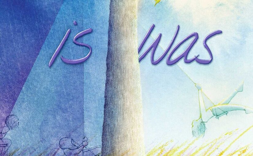
I make no mistake that I don’t get poetry. When it’s poetry that I enjoy, it’s packed in a stealthy wrapper that somehow conceals its hazy angles and esoteric nature. is was, in no way presents itself as a book that’s not poetic in nature. However, the book is so sparse on words and heavy on gorgeous illustrations that it has as much in common with a wordless book as it does with poetry. But then you go back to the title for the book, is was, you might be thinking it’s some high-brow book that most elementary students won’t like or understand.
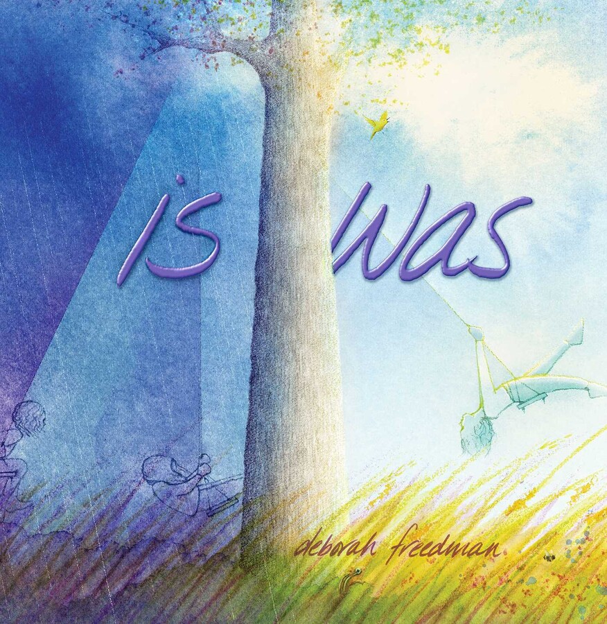
To an extent, is was, reminds us of a pre-k through mid-elementary version of The Tao of Pooh. It just is. It is not that we know a lot about or practice Taoism or any sense of method relaxation. However, we do love nature and spending time in it. I have no problem leaving my cell phone behind and would be quite comfortable without a computer. Having reassessed the way that I am and realizing that, is was, is more about the concept of nothingness and everything, let’s look at the book again.
Sure, is was, starts off with text that looks like poetry, but it doesn’t follow the same trappings that you’d expect. The text doesn’t rhyme and the second page of the book only has 12 words, which is about half of the total word count for the book. I did say that it has more in common with a wordless book than poetry, didn’t I?
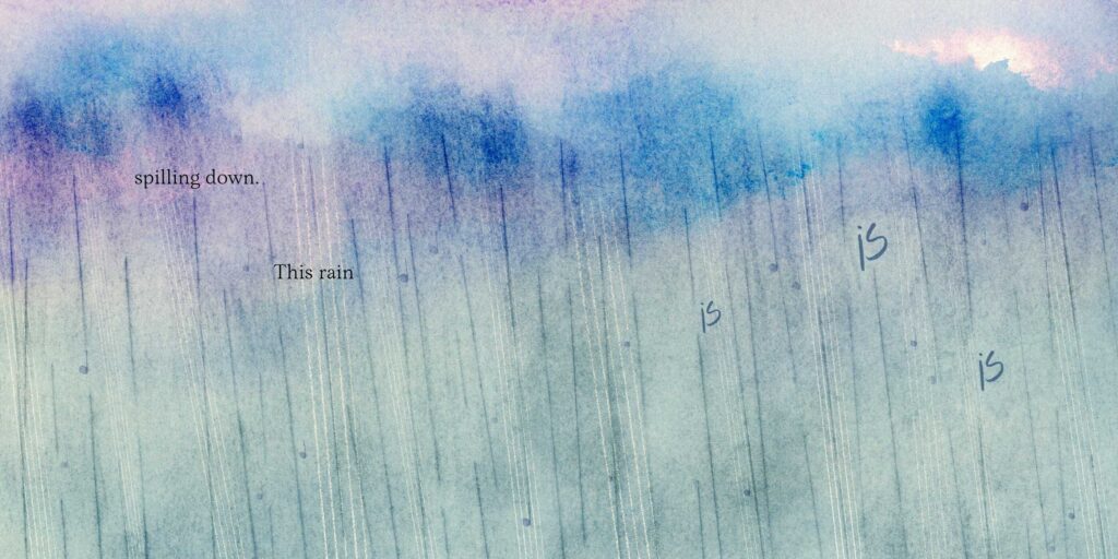
The book segues from naturalistic settings on a micro to a macro level. The rain falls, collects in puddles, and from there a series of animals tell the almost text-less story. The tiny spider web leads into the leaves, which gives way to the tree, then the fields, and the sky. At the end we see a person at a farmhouse looking at the night sky and to the side of the picture, there’s a small mouse. The same mouse that we saw at the beginning of the book.
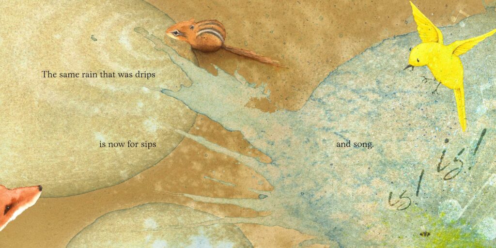
is was, is a book that succeeds because of its simplicity, fabulous artwork, and the fact that it lets readers discover things for themselves. This is a soft book that young readers could easily look through quickly and get nothing from, while some readers immediately ‘get it’. Those kids will spend time looking at the colors and filling in their own story. However, if kids are somewhat guided through the book then more would ‘get it’ initially, due in a major part to the full-size illustrations that tell a big story with very few words.
is was is by author/illustrator Deborah Freedman and available on Atheneum Books for Young Readers, an imprint of Simon & Schuster.
There are affiliate links in this post.


 Facebook
 Twitter
 Flickr
 GooglePlus
 Youtube