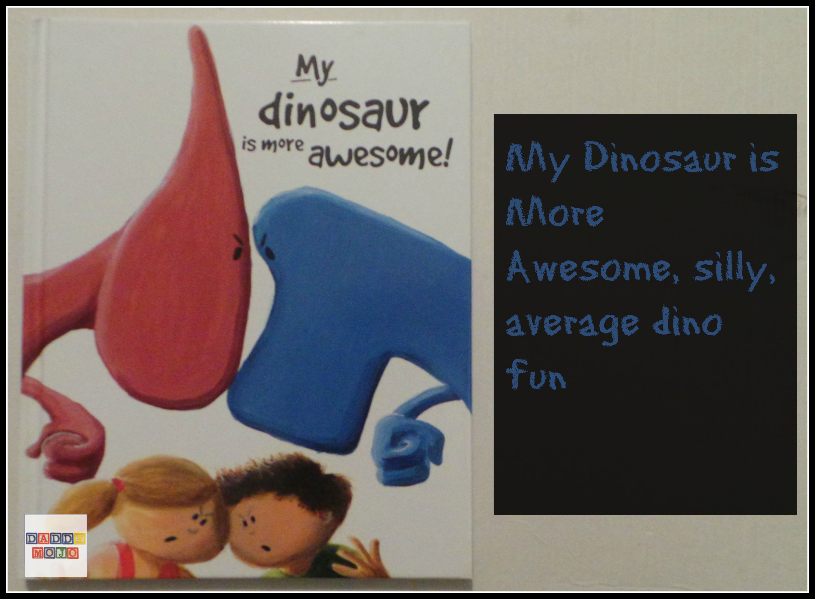
We love dinosaurs in this house. We have over 100 dinosaur figures of various sizes, our oldest yearns to see Jurassic World and he can still sing the ABC Dinosaur Train song. My Dinosaur is More Awesome is a silly dino book that most kids will like, but its presentation lacks that certain something that allows us (and our kids) to really enjoy the book.
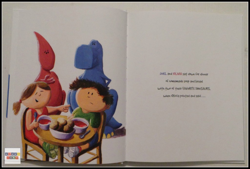
In a way My Dinosaur is More Awesome is a by the numbers children’s book that really should’ve entertained us. The book follows a well worn, but usually dependable script of siblings comparing things. Joel and Olivia are eating when she starts talking about her dinosaur and says that it’s better than his.
She goes on to point out how stylish its clothing is. He counters with how his is an amazing swimming and can glow in the dark. They go back and forth with each one coming up with more amazing ways that their dinosaur is more awesome.
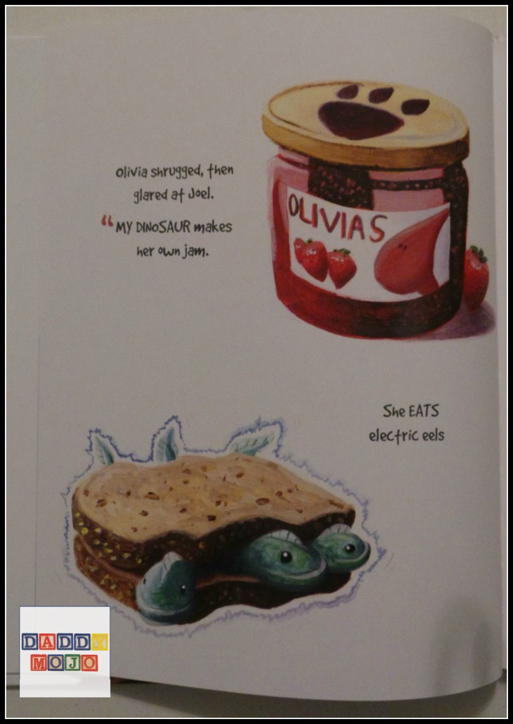
The back and forth between the kids does have rhythm and builds up a nice cadence. The artwork is quite nice and has a playful air to it that really lends itself to making the dinosaurs seem like extensions of the children. However, these two good things; that do make up the majority of the book don’t add up to a book that is really memorable.
Part of that certainly has to do with my personal bias of too much white space in the illustrations of a children’s book. I know, it’s kind of silly, but in this case it really slows down the forward momentum of the story.
A couple of the pages have a colored background. For the most part it’s the dinosaur doing something cool to make the most awesome, but it’s set against a white page. The pages that are full color with the dinosaur bragging are crisp, much more fun and really tell the story. Factor in its slow movement with the fact that it is about eight pages too long it’s not an asteroid that kills this dinosaur book.


 Facebook
 Twitter
 Flickr
 GooglePlus
 Youtube